
Lockup
Our primary logo. Use it first, wherever there's room.
How Rifle Range looks and sounds. Read it here, or download the PDF.

Rifle Range is named after the field our vineyard is planted in, on the Hurdcott Estate in Wiltshire. In the First World War this ground was part of Hurdcott Camp, home to Australian soldiers. Today 46,000 vines stand there in bullet-straight rows.
Vines rooted in history.
George has the land, the conditions and the story. The question was simple: could we do it? The answer was yes.
Planted in 2024 on the Hurdcott Estate, in bullet-straight rows. Every grape is hand-picked.
Bacchus and Chardonnay first, in small numbers. Blanc de Blancs, Pinot Noir and Rosé follow.
From late 1914 an army camp ran along the valley. The section on Hurdcott and Naish's farms became Hurdcott Camp.
Australians were based at Hurdcott from 1916, with sole use of the camp from 1917.
Hurdcott was home to the AIF's No. 3 Command Depot, and later No. 4. Men trained or regained their fitness there before returning to the front.
From 1917, Australian soldiers cut a map of Australia into the chalk of Compton Down. It sits directly above our vineyard today.
The map was scheduled as a monument in 2001 and restored by volunteers in 2018 to 2019.
Along the valley, regiments cut around 20 badges into Fovant Down, including the Australian Rising Sun.
Sources: Wiltshire OPC · Birtwistle Wiki · Historic England 1020133 · Historic England report 80/2018 · Historic England 1020132 · Fovant Badges Society · Australian War Memorial H16007. Don't add history that hasn't been checked.
Five core values, in order of importance. Rifle Range is made for love of the land, not for volume or quick returns.
To revive the story of Hurdcott Camp through premium English wine.
A landmark in Wiltshire, and a household name in English wine.
Grow the vineyard, the quality and the standing of the brand, year after year.
Discerning wine drinkers aged 40 to 70 who love the English countryside, its history and its finest produce. We don't try to convert people to wine. We speak to people who already love it.
Our main buyers. Private wine drinkers, 40 to 70.
Retailers, stockists and restaurants.
A bottle with a story, given with pride.
Early vintages and small releases.
Including Australian visitors drawn to Hurdcott Camp.
Tourists, and future guests of the estate.
Mid to upper class, traditional and proudly English. Into the countryside, shooting and history. Spends well in farm shops and local butchers. Already drinks Wiston and Gusbourne, fine Scotch and local ales.
Today, a new estate with a few thousand bottles and no online presence. In five years, a household name in English wine, priced alongside Nyetimber, Gusbourne and Wiston, but more exclusive and more heritage-led.
For discerning wine drinkers who love the English countryside and its history, Rifle Range is premium English wine from the Hurdcott Estate, grown on a field with a First World War story no other estate can tell.
A privilege to open. Exciting, exclusive, and like taking in a part of history.
Priced alongside them. More exclusive, and more heritage-led.
Being known matters more than bottles sold in the first year. Awards build the credibility a new name needs.
Year one: wine retailers, such as Majestic. Selling direct comes later.
Small, exclusive releases of around 2,000 bottles per wine, at a premium price.
The brand, the website and the first wines, in the new year.
Every wine on the website, with links to where to buy.
An online shop on the website.
A winery, restaurant, shop, tours, tastings and storage on the estate.
The national awards. A 2025 Bacchus won Best Still White in 2026. Entries in spring. WineGB membership needed.
The biggest consumer name. English Chardonnay won Platinum and Gold in 2026. Entries close 15 March 2027.
English Chardonnay won Gold and a trophy in 2026. Entries in March.
For the restaurant route. Still wines sold through national chains can't enter, so check first.
Our regional awards, with trophies for small vineyards. Judged in November.
For the Blanc de Blancs and Rosé, once released.
Wines must be bottled and on sale before each deadline. Each entry needs three or four bottles.
Formal, proud and quietly romantic. We speak like a distinguished country host: warm and down to earth, never boastful, with the discipline and order of the rifle range in every line.
Lead with the wine. Let the history fill in the detail.
Borrow the order and precision of military life. Never mention violence, death or blood.
Confident and well made, but down to earth. We never show off.
Story and feeling first, then the wine.
Facts first: varieties, vintage, volumes, awards. Same tone, less romance.
Rarity and numbers for collectors. The verified history, told plainly and with respect.
What we want people to remember about Rifle Range. Start from these on the website, on labels and on social.
Vines rooted in history. Premium English wine, grown on land with a remarkable place in British history.
Our vines grow on the Hurdcott Estate, in the heart of Wiltshire. The ground is carefully tended, its legacy preserved.
Every vine is tended with discipline and care. Quality comes before quantity.
Premium English wine of clarity and poise, made with craft and precision from vine to bottle.
Small first releases, for people who want something few others have.
Our vines stand in bullet-straight formation on the rifle range of Hurdcott Camp, where Australian forces were marshalled for service in the First World War.
Made for love of the land and pride in Wiltshire. Not for volume, and not for quick returns.
Of clarity and poise. Citrus, elderflower, green apple and hedgerow, to a clean, mineral finish.
Of depth and elegance. Stone fruit, honeyed citrus and toasted almond, to a smooth, lingering finish.
From Chardonnay, of precision and finesse. Citrus, green apple and chalky minerality, to a long, poised finish.
Of depth and quiet intensity. Red cherry, wild strawberry, spice and woodland notes, to a refined finish.
Of elegance and balance. Red berry, citrus, soft florals and a hint of cream, to a crisp finish.
Traditional names, led by the grape, then the vintage. Around 2,000 bottles of each.
A few simple rules so everyone writes about Rifle Range the same way.
colour, flavour, organise
Always Rifle Range, never The Rifle Range. Capitals only in the logo.
One idea per sentence. Cut any word that doesn’t add something.
We planted our first vines in 2024. Not: Rifle Range planted its first vines in 2024.
We planted the vines in bullet-straight rows. Not: The vines were planted in bullet-straight rows.
Our wines. Not: Our Wines.
Use numerals: 9 hectares, 46,000 vines. Spell out a number only at the start of a sentence.
2 September 2026. 9am, 5.30pm.
The wine, then the vintage: Bacchus, Vintage 2025.
Use estate, vineyard and vintage freely. Hurdcott Estate with a capital E, then the estate.
No exclamation marks. Write “and”, not “&”, in sentences.
Say what you mean. Avoid the words below.
Grown on the old rifle range of Hurdcott Camp.
Grown where soldiers once fought and died.
Bacchus, Vintage 2025. Our first release.
Our amazing new wine is finally here!
Made with care, from the vine to the bottle.
Passionate about delivering world-class wine.
The brand, named after the field the vineyard stands in. Never The Rifle Range.
The estate the vineyard stands on. Capital E, then the estate.
The strapline. In running text: vines rooted in history.
Our crest. Never describe it as an army badge.
The mirrored double R. Our social profile picture.
The harvest year, after the wine: Bacchus, Vintage 2025.
Our [wine] is a still English [colour] wine of [quality] and [quality]. [Notes] lead, followed by [notes], carried through to a [quality] finish.
Where the name comes from. What happened here. Today, the same ground is carefully tended. The vineyard echoes its former use. A closing line on legacy.
Say 9 hectares and 46,000 vines. Not one of the finest vineyards in England. Superlatives wait for awards and proof.
The First World War camp on Hurdcott and Naish's farms.
The Australian Imperial Force.
Where Australian soldiers trained or regained their fitness before returning to the front.
The map cut into the chalk of Compton Down by Australian soldiers, from 1917.
The regimental badges cut into Fovant Down, cared for by the Fovant Badges Society.
Sparkling wine made only from white grapes. Ours is from Chardonnay.
Where Rifle Range speaks, and how the voice adapts to each.
The full story, the wines and where to buy. Wine first, history behind it.
The brand in the hand. Follow the tasting-note and heritage patterns.
Our main social channel. Golden hour, details, the land. Short captions, one idea each. No emoji.
Wiltshire, the local community and events. A little more conversational.
Trade, partners, milestones and awards. Facts and news.
Short and personal from the estate. For press and trade, facts first.
3 to 5 per post, at the end: one brand tag, then the rest to suit the post.
The rules that protect the brand, the estate and the people behind it.
Mention the estate freely. Never say where George lives, mention his other estates or name the founders.
Moments of respect, not marketing. At most a quiet acknowledgement. No products, no offers.
Paid ads target 18+ only. Anyone shown drinking must be, and look, over 25. Wine never brings confidence or social success.
Only verified facts. No superlatives until there are awards or proof to back them.
Plain English. Alt text on every image, captions on every video. No body copy in capitals.
Rifle Range is registered. Use the marks as supplied, never redrawn.
The first is an ambition, not a fact. The rest wait for proof, awards or the winery moving in-house.
To show the tone in action. Adapt them to the job rather than copying them word for word.
Rifle Range takes its name from the field on which these vines now stand. Land once utilised by Australian forces, marshalled for service and purpose as the rifle range of Hurdcott Camp during the First World War. Today, the same ground is carefully tended with its legacy preserved. The vineyard, laid in bullet-straight formation, echoes the discipline and order of its former use, redefining it through craft and precision. Each bottle reflects the courageous stories once woven into this historic landscape.
Our Bacchus is a still English white wine of clarity and poise. Bright citrus and elderflower lead, followed by green apple and subtle hedgerow notes, carried through to a clean, mineral finish.
Golden hour over the vineyard. 46,000 vines, in bullet-straight rows, on the Hurdcott Estate.
Bacchus, Vintage 2025. A still English white wine from 9 hectares on the Hurdcott Estate, Wiltshire. Limited release.
Four marks, one family. The lockup leads. The wordmark, monogram and the Vigneron Crown support it, with a roundel, profile picture and favicon for small spaces. Every download comes in Heritage green, cream, gold, gold gradient, black and white, as SVG, PNG, JPG, PDF and EPS.
Our primary logo. Use it first, wherever there's room.

For wide, shallow spaces, such as a website header or the neck of a bottle.
For small spaces and finishing touches, once the name is already clear.

Our crest. For capsules, seals and special moments. Never in place of the lockup.

The capsule top. For stickers, seals and round spaces. Two colours only.

The RR monogram, for every social media profile.

For browser tabs and app icons.
Cream comes first. Use the logo only in these pairings, and always from the supplied files.




The lockup artwork runs edge to edge: exactly as wide as the RIFLE RANGE letters and as tall as the monogram and letters together. Around it, leave clear space equal to x, the full height of the lockup, on every side. For the wordmark, x is its height. For the monogram, crest and roundel, x is a quarter of their height. The clear-space downloads are built to these measures.
| Version | Screen | |
|---|---|---|
| Lockup | 160px | 40mm |
| Wordmark | 140px | 35mm |
| Monogram | 32px | 10mm |
| Vigneron Crown | 48px | 15mm |
| Roundel | 40px | 12mm |
Smaller than this, use the monogram. Gold foil needs more room than ink, so check fine detail with Amberley Labels at proof.
Always use the supplied files as they are.
 Rifle Range
Cream leads. It is the paper of the label and the ground of everything we make. Heritage green gives weight and contrast. Gold is the finishing touch: foil on the bottle, a hairline on screen. Click any colour to copy its value.
Cream deepening towards gold, like aged paper. Cream 100 is our cream. Use the deeper tones for layering: a panel on a page, a band, a card. Heritage green text passes on every tone.
Shades of Heritage green, mixed with cream. 100 to 60 work for text on cream. 50 and lighter are for dividers and lines.
For screens only, on large gold marks such as the crest. It gives the feel of foil catching the light. Flat gold for hairlines and small marks. In print, gold is always foil.
Mostly cream and space. Green for type and weight. Gold in small, deliberate touches.
All text and marks.
All text and marks.
All text and marks.
Headings, figures, labels and marks.
Short labels and buttons only.
Large marks and hairlines only. Never text.
Start every layout on cream. Green is for contrast and weight, not the default background.
Gold appears as hairlines, initials, figures and foil. Never a large fill or a background.
Gold is Gold 429 N GTS hot foil, and the green is Amberley’s mix cs9356-694, both from the signed proof. CMYK and Pantone values still to confirm.
IvyJournal carries the brand: headings in Regular, reading text in Light. Inter is a quiet support act for small capitals and the small print, as on the back label.
Sizes are shown for screen, then print. On mobile, reduce headings by about a third. This site shows IvyJournal through a free stand-in until its web licence is in place, so letter shapes here differ slightly. Always set real work in IvyJournal.
Labels, covers and short formal moments are centred. Long text is always left-aligned.
For headings and subheads. Spaced capitals only for the name and short labels.
Where IvyJournal isn't available, such as email, use Georgia. Where Inter isn't, use Arial.
Editorial, spacious and confident. Gold accents come from the label: hairlines, initials, figures and numerals. Use one treatment as the lead in a layout, and let the cream around it do the rest.
Rifle Range takes its name from the field on which these vines now stand. Land once utilised by Australian forces, marshalled for service and purpose as the rifle range of Hurdcott Camp during the First World War.
Each bottle reflects the courageous stories once woven into this historic landscape.From the back labelOne treatment leads each layout. At most one more supports it.
No gold boxes behind words, no underlines that look like markers. Hairlines, initials and numerals only.
Give every treatment room. If it feels crowded, take something away.
Bold, heritage and clean, like a good magazine. Large Light headlines, Regular capitals for weight, gold for numerals and notes, and plenty of cream.
The rifle range of Hurdcott CampFrom First World War camp to English vineyard: the story of the field that gave Rifle Range its name.
Words by Rifle RangeToday, the same ground is carefully tended with its legacy preserved.
From the back labelFrom 1917, Australian soldiers cut a map of Australia into the chalk of Compton Down. It was scheduled as a monument in 2001.1
Rifle Range takes its name from the field on which these vines now stand. In the First World War this ground was part of Hurdcott Camp, home to Australian soldiers.
Body text sits in a column of 60 to 70 characters, in IvyJournal Light at 17px with a line height of 1.6. Paragraphs are separated by space, not indents. Lines are never left hanging with a single word.
Headlines are large and Light. Regular is for capitals, wine names on the bottle and a word of emphasis.
Spaced capitals for inscriptions, captions and the vintage. Never for running text.
Numerals, note marks, hairlines and the opening quote. Never whole headlines.
The Vigneron Crown carries the brand beyond the label. It seals, signs off and adds quiet ceremony, always in gold and always with room around it.
Vintage 2025BacchusHurdcott Estate · Wiltshire · riflerange.co.ukWith complimentsHurdcott Estate · WiltshireThe Vigneron CrownCrafted with discipline and careGold foil in print, gold or gold gradient on screen. Green only for the watermark, at 6%.
One crest per layout. Never repeated as a pattern.
Never beside the lockup at a similar size.
The land, the vines and the grapes, at golden hour. Close details and wide views, warm light, nothing staged. All photography here is from the September 2026 shoot on the estate.
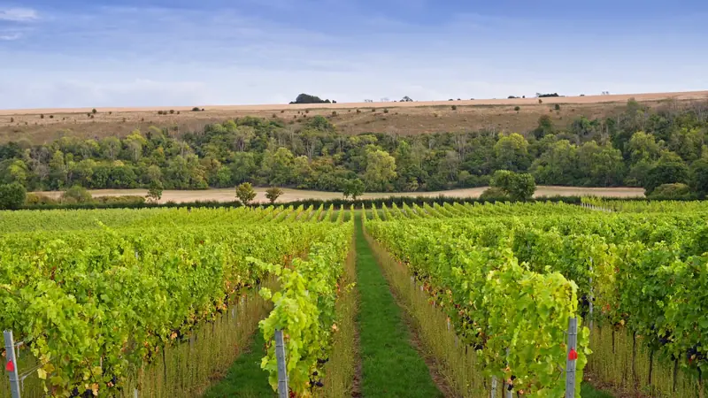
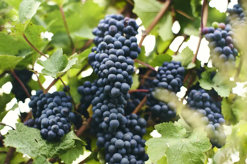
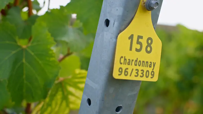
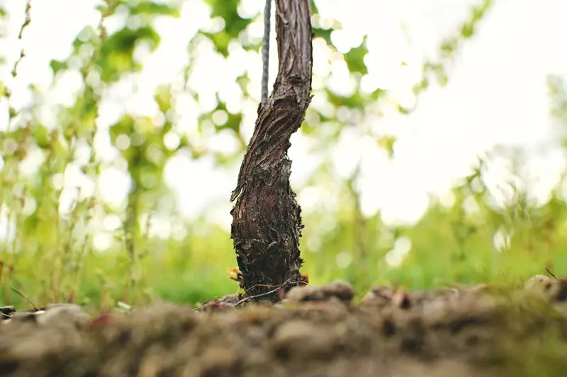
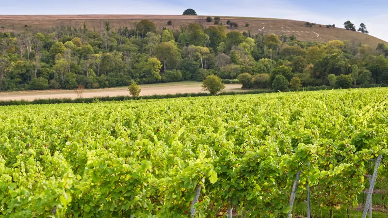
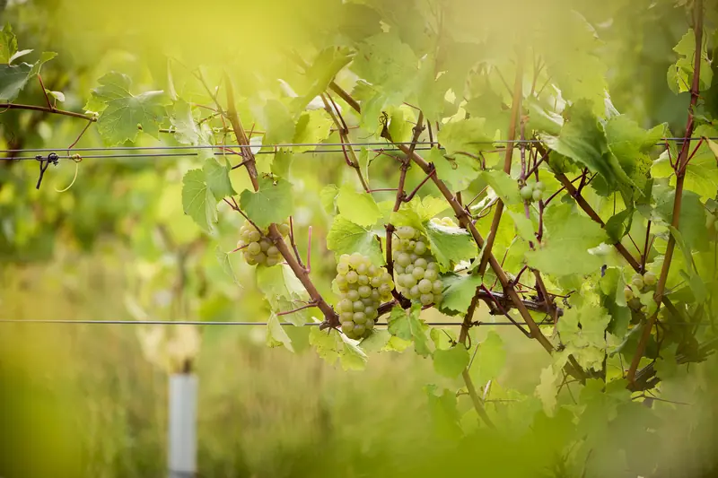
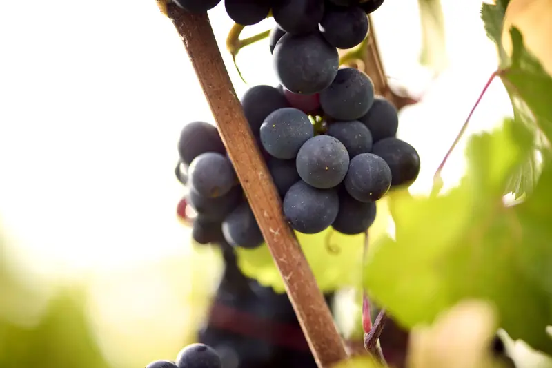
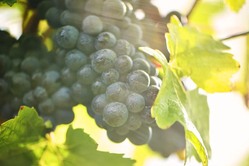
Early morning or evening light. Warm, low and soft. Avoid flat midday light.
Pair a detail with a wide view. The land and the fruit tell the story.
Hands at work are welcome. Anyone shown drinking must be, and look, over 25.
Six ways to use our photography. Each one keeps the image honest and the page calm.
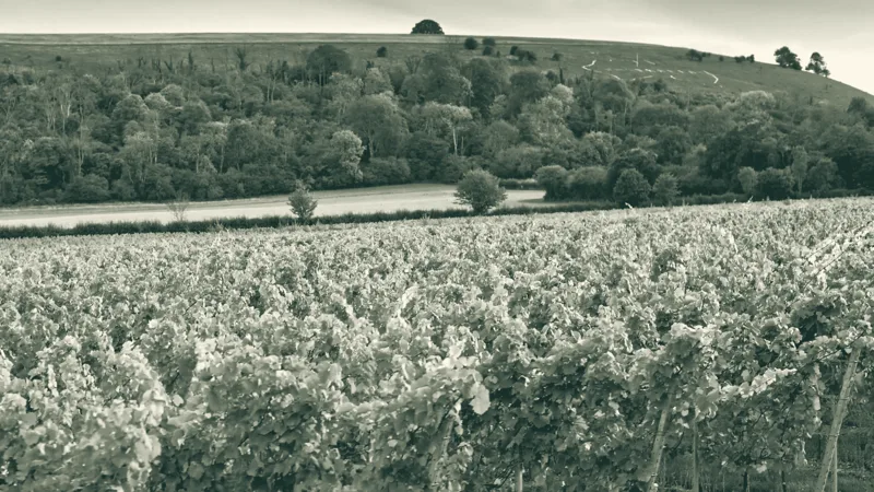
Every grape is hand-picked.
Our own estate and wines, in natural colour. Heritage tone is the only filter.
Type sits on cream beside or below the image. Over a photo only with the soft green shade.
No rounded corners, frames or drop shadows.
Square, spacious and editorial. Twelve ways to build a page, from a label to a poster to a social post.
Vines Rooted in HistoryBacchusWe planted our first vines in 2024, on the field that gave Rifle Range its name.
46,000 vines stand in bullet-straight rows, tended with discipline and care.
Read our storyGolden hour over the vineyardVines Rooted in HistoryHurdcott Estate · WiltshireAt least a tenth of the page width. More is better.
One headline, one image or one figure leads.
Centred for covers and short moments. Long text is always left-aligned.
Hairline rules in green or gold divide content. No boxes.
Start on cream. A deeper cream tone or green changes the pace.
Short, spaced Inter capitals for captions, places and dates.
How the system comes together in print and on screen: a spread, a cover, an opener, a photo essay, a tasting card, menus and a social set.
Rifle Range takes its name from the field on which these vines now stand. In the First World War this ground was part of Hurdcott Camp. Today 46,000 vines stand here in bullet-straight rows.

How a First World War field in Wiltshire became a vineyard.
Pinot Noir at golden hour, September 2026. Every grape is hand-picked.
BacchusOf clarity and poise. Citrus, elderflower and green apple, to a clean, mineral finish.
riflerange.co.ukOur winesHarvest supper
Every piece starts from the words. Follow the voice guidelines and use only checked facts.
One item to a ruled line. Wine names in IvyJournal, styles in capitals, pairings in gold.
Set in IvyJournal beside the wine, never in bold.
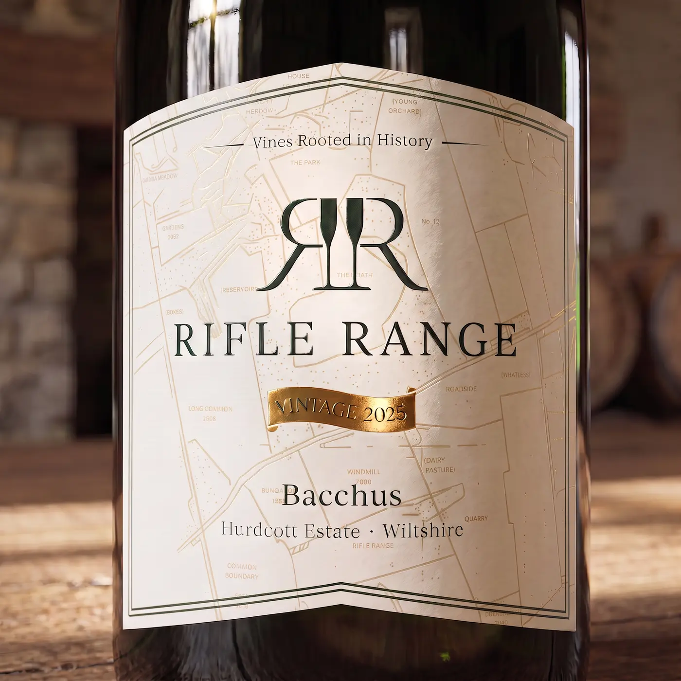
The label is where the brand was born. A cream front with the estate map in gold and a foil Vintage ribbon. A Heritage green back with the tasting note and the heritage story, and a cream panel for the legal details.
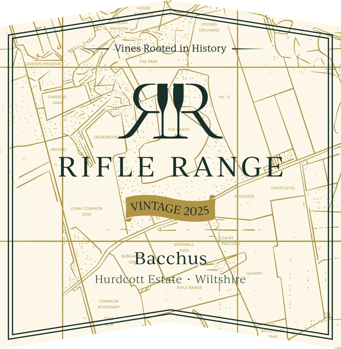
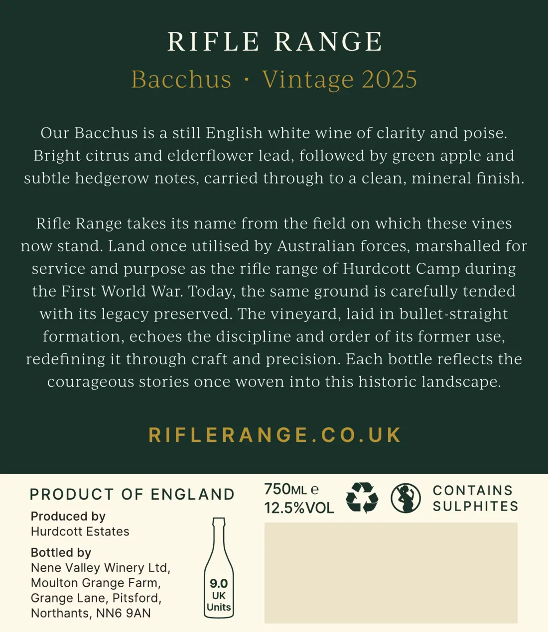
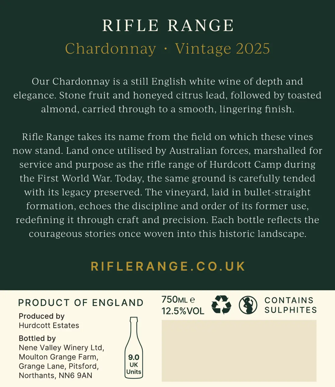
Back labels from the May 2026 masters. The barcode area is shown blank.
Cream, with the estate map in gold behind everything, the lockup, the foil Vintage ribbon and the wine name.
Heritage green, with the wine and vintage in gold, the tasting note, the heritage story and riflerange.co.uk in gold capitals.
A cream band at the foot of the back label, in Inter, for the producer, volume, strength, units and symbols.
Cream fronts for white and rosé wines. The inverted dark front is for red wine, so it stands apart on the shelf.
Gold and green foils, with the Vigneron Crown on the neck and the roundel on top.
Foil, embossing and debossing are checked on press with Amberley Labels.
From the signed Amberley proof, 1 October 2026.
Our own set, drawn for Rifle Range. One fine, even line with square ends, and subjects from the estate: the glass, the bottle, the vine, the crown and the downs.
The smallest size. Next to text, in lists and contact details.
The default. Navigation, forms and wine details.
Feature icons, with a short title beneath.
Draw it on the same grid with the same 0.9 line. Keep it simple enough to read at 24px. New icons are added to this set, never taken from another library.
Heritage green on cream, cream or gold on green. Never a tint, never two colours in one icon.
Only icons from this set. Don’t mix in other libraries or filled icons.
Pair an icon with a label. Only universal icons, such as menu and close, stand alone, and they still need a name for screen readers.
Square and quiet, with the label in spaced Inter capitals, like riflerange.co.uk on the back label. A gold arrow gives each one a little life. On hover the colour changes and the arrow steps forward. The button never changes size. Hover over the standard buttons to see it.
One primary button in each section. Everything else is secondary or a text link.
Short, specific labels: Discover our wines, not Click here.
Square corners, no borders, no shadows.
The basics every page follows. Components, image treatments and motion will be added once the brand detail is signed off.
Pages start on cream. Green bands and deeper cream tones change the pace.
Square corners everywhere. Generous margins and space between sections.
One headline, one sentence and one button in a hero. The history follows.
Headings in sentence case. Spaced capitals only for the name, labels and buttons.
Only claims, figures and names Rifle Range have confirmed. Anything else is marked [TBC].
Every page checks visitors are of legal drinking age before entry.
Icons from the Rifle Range set, always with a label.
Our own estate and wines. AI images only as labelled placeholders.
WCAG 2.2 AA: 4.5:1 for text, 3:1 for large text and controls, visible focus, works with a keyboard.
A printable PDF of the brand guidelines.

